
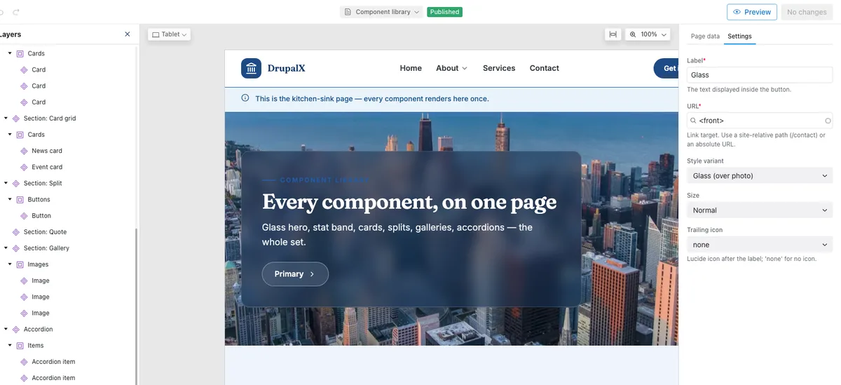
Editors compose real pages in Canvas
Drupal's Experience Builder, loaded with a component library that was designed for it. Drag from the library, edit props as plain form fields, nest cards into grids — the developer round-trip is gone.
Drupal 11 · Canvas · Tailwind v4 · GPL
A project template that pairs Canvas page building with a Tailwind design system — 24 schema-guarded components your team composes in the CMS. One command lands a complete five-page demo site.
# a working Drupal site, three commands
$ git clone https://github.com/nextagencyio/drupalx-project.git
$ cd drupalx-project && ddev start
$ ddev install
# → five-page demo site · admin / admin24
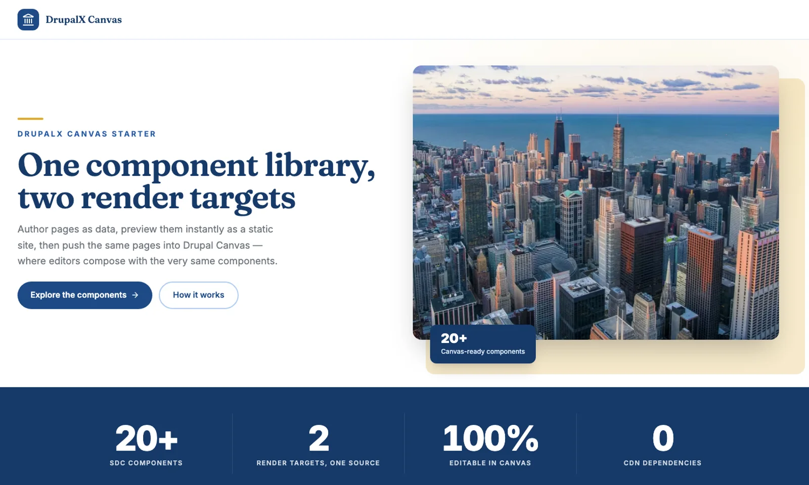
Canvas-ready components
5
demo pages on install
0
CDN dependencies
GPL
open source, like Drupal
Why DrupalX
Drupal's Experience Builder, loaded with a component library that was designed for it. Drag from the library, edit props as plain form fields, nest cards into grids — the developer round-trip is gone.
Aa
Fraunces display + Inter body, a full brand scale, two wayfinding color families — all Tailwind v4 tokens in one file.
Self-hosted variable fonts, Lucide icons inlined as SVG at build time, width-stepped WebP images via dx_image. Fast is the default.
Schema-validated props: enums become selects, images use the media library, repeatable content is real nested components. On-brand is the only option.
The same Twig renders in a Twing static workbench — iterate on components in milliseconds, then drush cr puts them in the editor.
The component library
components/button/button.component.yml
props:
  label:
    type: string
    title: Label
  url:
    format: uri-reference
  variant:
    enum: [primary, accent, ghost, glass]
  icon:
    enum: [none, arrow-right, …]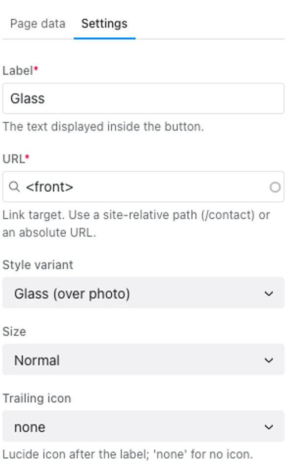
The theming system
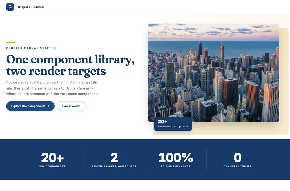
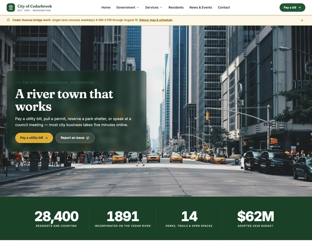
Every brand decision is a token. These are the same components — the starter palette and a river-teal nonprofit brand, one CSS block apart.
/* global.css — the whole brand */
@theme {
  --color-primary-500: #106efd;
  --color-accent-500:  #41e2f8;
  --font-display: 'Fraunces Variable';
  /* + sky & clay wayfinding families */
}
The workflow
One command builds Drupal 11 + Canvas and imports the five-page demo — pages, media, menus, the lot.
Open any page in the Canvas editor. Drag components from the library, edit props as form fields, nest cards into grids.
New component = one folder: a schema + a Twig file. Preview it in the live-reload workbench, then clear caches.
The editing experience
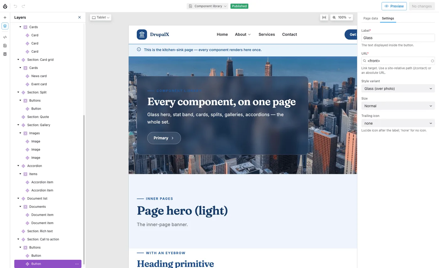
↖ Every component, a layer
Enums become selects →
The live page, mid-edit
FAQ
The short version: it's a template you own, editors can't break it, and Node is optional.
More in the READMEFree & open source · GPL, like Drupal
$ git clone https://github.com/nextagencyio/drupalx-project.git
$ cd drupalx-project && ddev start
$ ddev install # → five-page demo · admin / adminWalk through the five-page demo with your team. Rebrand it Monday.
GPL-2.0-or-later · free for client work · no lock-in